ROLE
UX/UI Designer
Duration
July - October. 2022
TEAM
UX/UI Team

Rental Marketplace Platform
Project Description
When I joined the project, CampGem’s housing rental website had a basic developer-built interface but no UX/UI design process. I was brought in to redesign the platform and improve the experience for renters and landlords.
CampGem
CampGem is an end-to-end rental marketplace platform that allows users to list, apply for, and manage rentals in one place.
Impact
The redesign improved the platform experience, leading to increased rental listings and stronger user engagement.
120
Properties Rented Last Year
1000+
Properties for Rent
800+
Service Providers
Research & Insights: Audited the Website and Synthesized User Needs
Research Synthesis
Before starting the design, I reviewed and synthesized research findings from the research team to understand the needs of both tenants and landlords.


Tenant Expectations
Website Audit
To support the redesign, I conducted a website audit and competitive analysis to identify gaps, opportunities, and areas for improvement.
Problem Statements
Based on the analysis, the following three problem statements summarize the key challenges for the redesign.
Tenants were overwhelmed by complex rental options
Landlords found the listing process cumbersome
There was no clear distinction between tenant and landlord needs.
Information Architecture: Created User Flows and a Sitemap to outline the foundation of the website
Although the entire website required a redesign, the first priority was to create MVP user flows and a Sitemap to establish the information architecture and define the basic framework of the platform.
Sitemap

MVP User Flows
Tenants Flow
How do tenants explore and search for their ideal rental home?
How do tenants consult with landlords and apply for a property?
Landlord Flow
How can landlords efficiently post new listings and manage existing ones?
How can landlords track applications and finalize rental agreements with tenants?

Design Solutions: From challenges to improved tenant and landlord experiences
Tenant-Side Challenges
Rental information lacks clarity and is difficult for tenants to discover and navigate
CampGem's diverse rental options create information overload, making it hard for tenants to quickly understand listings and compare rooms within the same property.

1.
Complex User Cases
CampGem offers multiple rental types, making it challenging for tenants to quickly digest all information.
2.
Disorganized Content Structure
3.
Difficulty Locating Specific Rooms
Design Solution
To simplify how rental types are displayed, helping users understand and navigate complex rental situations more intuitively and efficiently.

Solution 1 - Streamline Room Browsing
By allowing tenants to expand and collapse housing options in one view, the design reduces unnecessary clicks and provides a clear, structured way to compare rooms, improving browsing efficiency and decision-making.
Solution 2 - Clear Information Hierarchy

1.
Overloaded Submission Form
An overloaded, single-page submission made property listing difficult for landlords.
2.
Confusing property add flow
3.
Unclear Content and Layout Hierarchy
Landlord-Side Challenges
Landlords found the listing process cumbersome
While CampGem supports direct property listings like other rental platforms, its flexibility in unit types and rental modes creates added complexity in the listing experience.

Solution 1 - Multi-step Submission
A multi-step submission flow with a progress bar helps landlords complete listings step by step and track progress.
Solution 2 - Clear Content Hierarchy
Solution 3 - Logical Property & Room Setup Flow
Design Solution
Redesign the property-adding flow for landlords to be more logical and intuitive.
Reorganize and reclassified rental information fields to improve clarity and ease of use.
Tenant & Landlord Challenges
There was no clear distinction between tenant and landlord account needs
As a housing rental platform, CampGem serves two distinct user groups — tenants and landlords — each with different goals and purposes. The platform’s features must therefore address the unique needs of both.

1.
Confusing Combined Accounts
A combined tenant–landlord account structure created confusion and navigation issues.
2.
Unclear Labeling
Design Solution
Eliminate confusion caused by combining tenant and landlord functions under one account.
To create a clear and consistent labeling system that guides users naturally through their tasks.
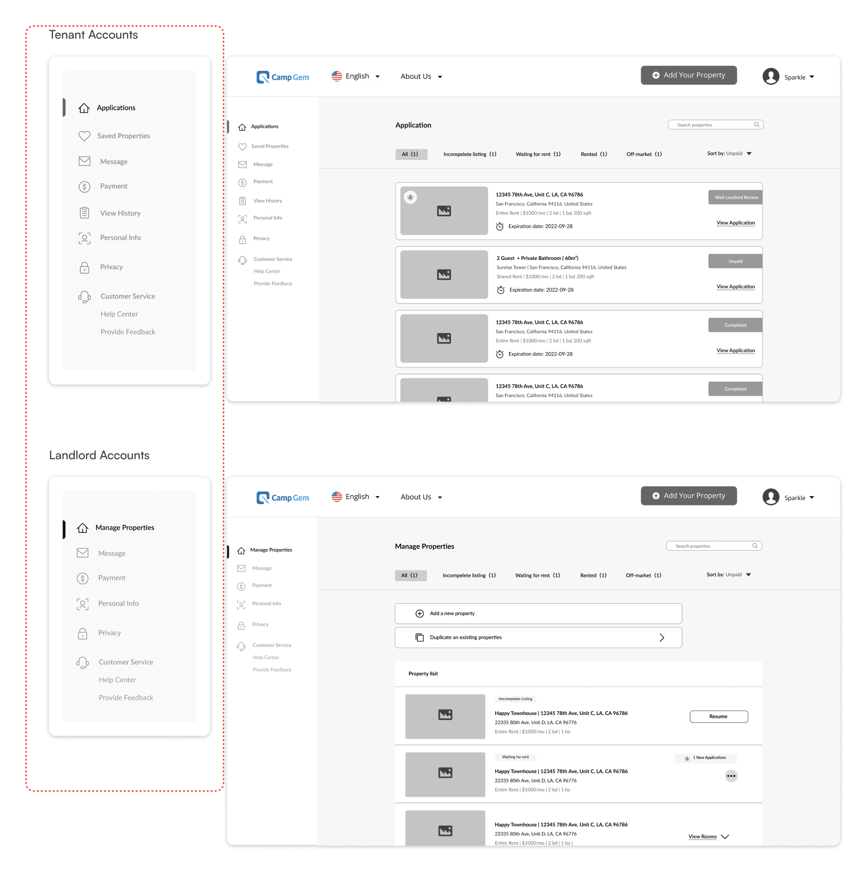
Solution 1 - Separate Account Flows
Separate tenant and landlord flows reduce complexity, with a navigation bar for easy switching.
Solution 2 - Clear Navigation Labels
Visual Design Highlights
Rebranding & Design System
I also led the rebranding of the CampGem website in collaboration with designers from the mobile team. Together, we defined the brand’s color palette and typography.
Afterward, I redesigned the entire website and built a comprehensive design system. It was an exciting experience—my first time developing a project from the ground up!
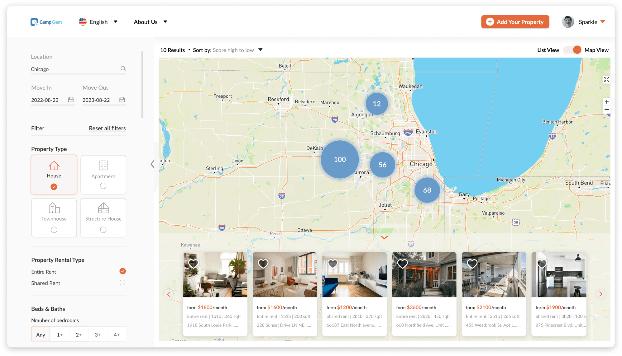
Property Listings Map View
The map view lets tenants visualize listing, apply filters, and view property cards directly on the map to find suitable rentals.
After

Before
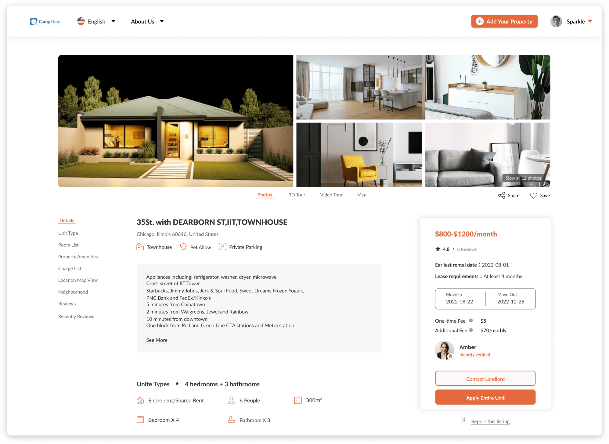
Streamlined Property Detail Experience
The redesigned property detail page uses a more compact layout and clearer content hierarchy, making listing information easier to scan, understand, and compare.
After

Before
Simple Application Flow
A clear, step-by-step application flow with a progress indicator helps tenants complete rental applications easily and without uncertainty.

After

Before
Role-Based Account Experience
The account system was redesigned to separate tenant and landlord accounts, providing clearer information architecture and making it easier for both user types to manage their activities and settings.

After

Before
Color Palette
Redesigned all visual assets — colors, fonts, and other branding elements for a cohesive website identity, in close collaboration with the mobile design team to maintain consistency.
Color Exploration

I initially proposed a blue palette, as the stakeholders wanted to convey a professional feeling to users. However, after the researchers shared their user findings, we felt that a warmer tone, such as orange, would better suit our use cases.
To explore this, I created mockups of different options, which made it easier and more intuitive for us to make a decision.
Final Color Palette

Typography
Font

Lato
We chose Lato as our font because its modern style aligns with the look and feel of our website and resonates with our target users
Components
Web Components
I created reusable components and design guidelines for the website to ensure consistency across platforms.
These reusable components and guidelines were leveraged by the mobile team, improving efficiency and reducing development costs.


Visual Design Highlights
Rebranding & Design System
I also led the rebranding of the CampGem website in collaboration with designers from the mobile team. Together, we defined the brand’s color palette and typography.
Afterward, I redesigned the entire website and built a comprehensive design system. It was an exciting experience—my first time developing a project from the ground up!
Property Listings Map View
The map view lets tenants visualize listing, apply filters, and view property cards directly on the map to find suitable rentals.
After
Before
Streamlined Property Detail Experience
The redesigned property detail page uses a more compact layout and clearer content hierarchy, making listing information easier to scan, understand, and compare.
After
Before
Simple Application Flow
A clear, step-by-step application flow with a progress indicator helps tenants complete rental applications easily and without uncertainty.
After
Before
Role-Based Account Experience
The account system was redesigned to separate tenant and landlord accounts, providing clearer information architecture and making it easier for both user types to manage their activities and settings.
After
Before
Color Palette
Redesigned all visual assets — colors, fonts, and other branding elements for a cohesive website identity, in close collaboration with the mobile design team to maintain consistency.
Color Exploration
I initially proposed a blue palette, as the stakeholders wanted to convey a professional feeling to users. However, after the researchers shared their user findings, we felt that a warmer tone, such as orange, would better suit our use cases.
To explore this, I created mockups of different options, which made it easier and more intuitive for us to make a decision.
Final Color Palette
Typography
Font
Lato
We chose Lato as our font because its modern style aligns with the look and feel of our website and resonates with our target users.
Components
Web Components
I created reusable components and design guidelines for the website to ensure consistency across platforms.
These reusable components and guidelines were leveraged by the mobile team, improving efficiency and reducing development costs.


Reflection
Strong information architecture and intuitive user flows enable users to act efficiently on the website. To support multiple rental types without overwhelming users, key information is surfaced upfront while collapsible sections reveal additional details. This allows users to access and compare listings on a single page.
Rental Marketplace Platform
ROLE
UX/UI Designer
TEAM
UX/UI Team
duration
July - October. 2022
Project Description
When I joined the project, CampGem’s housing rental website had a basic developer-built interface but no UX/UI design process. I was brought in to redesign the platform and improve the experience for renters and landlords.
CampGem
CampGem is an end-to-end rental marketplace platform that allows users to list, apply for, and manage rentals in one place.
Impact
The redesign improved the platform experience, leading to increased rental listings and stronger user engagement.
Properties Rented Last Year
Properties
for Rent
Service
Providers
Research & Insights: Audited the website and synthesized user needs
Research Synthesis
Before starting the design, I reviewed and synthesized research findings from the research team to understand the needs of both tenants and landlords.
Tenant Expectations
Website Audit
To support the redesign, I conducted a website audit and competitive analysis to identify gaps, opportunities, and areas for improvement.
Tenants were overwhelmed by complex rental options
Landlords found the listing process cumbersome
There was no clear distinction between tenant and landlord needs
Problem Statements
Based on the analysis, the following three problem statements summarize the key challenges for the redesign.
Information Architecture: Created User Flows and a Sitemap to outline the foundation of the website
Although the entire website required a redesign, the first priority was to create MVP user flows and a Sitemap to establish the information architecture and define the basic framework of the platform.
Sitemap
MVP User Flows
Tenants Flow
How do tenants explore and search for their ideal rental home?
How do tenants consult with landlords and apply for a property?
Landlord Flow
How can landlords efficiently post new listings and manage existing ones?
How can landlords track applications and finalize rental agreements with tenants?
Design Solutions: From challenges to improved tenant and landlord experiences
1.
Complex User Cases
CampGem offers multiple rental types, making it challenging for tenants to quickly digest all information.
2.
Disorganized Content Structure
3.
Difficulty Locating Specific Rooms
Tenant-Side Challenges
Rental information lacks clarity and is difficult for tenants to discover and navigate
CampGem's diverse rental options create information overload, making it hard for tenants to quickly understand listings and compare rooms within the same propert.
Solution 1 - Streamline Room Browsing
By allowing tenants to expand and collapse housing options in one view, the design reduces unnecessary clicks and provides a clear, structured way to compare rooms, improving browsing efficiency and decision-making.
Solution 2 - Clear Information Hierarchy
Design Solution
To simplify how rental types are displayed, helping users understand and navigate complex rental situations more intuitively and efficiently.

1
Complex User Cases
CampGem offers multiple rental types, making it challenging for tenants to quickly digest all information.
2
Disorganized Information Structure
The lack of a clear content hierarchy led to user confusion and difficulty understanding key information.
3
Difficulty Locating Specific Rooms
Tenants struggle to find and compare rooms in multi-unit shared rentals due to excessive clicks.
1
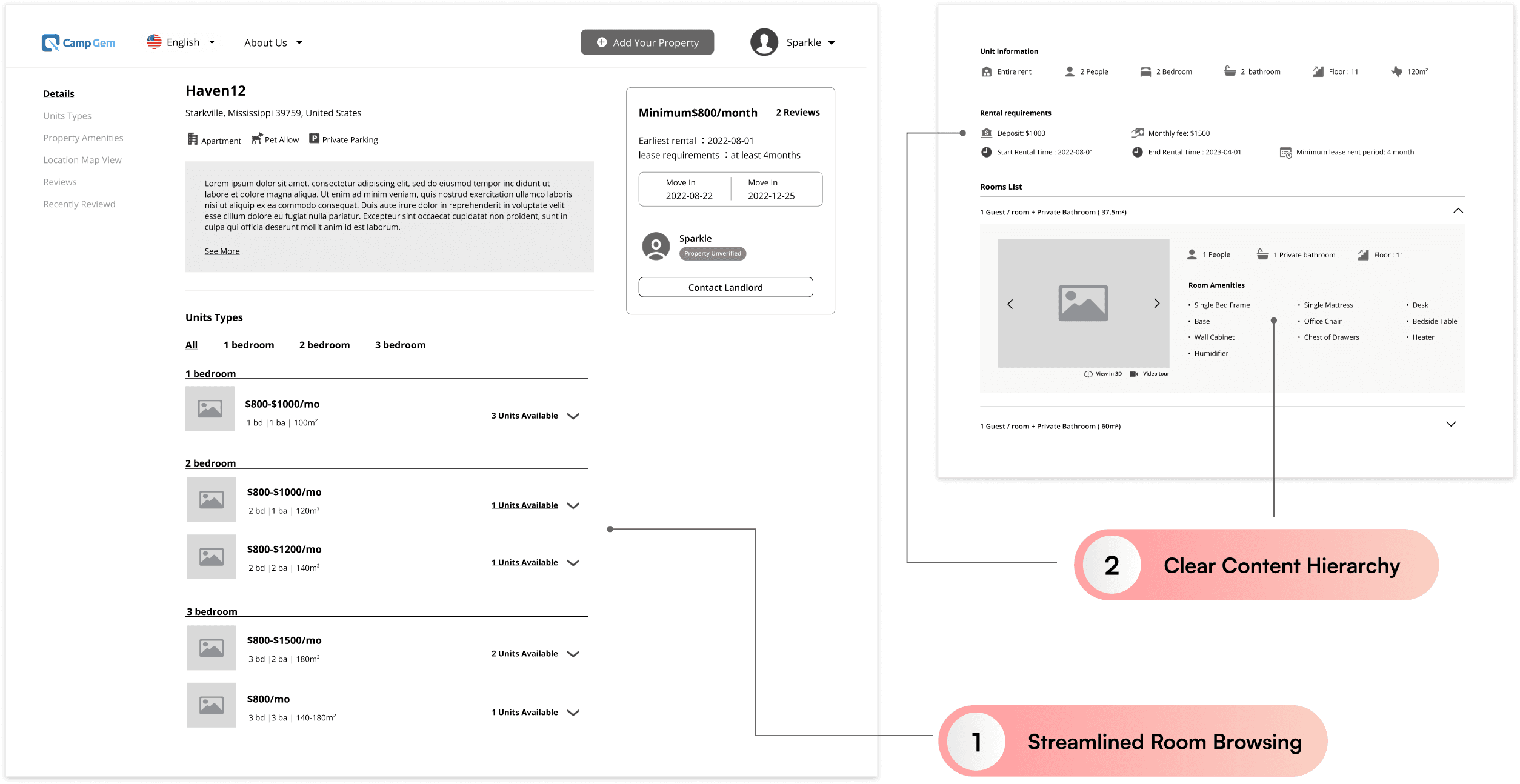
Solution 1 - Streamline Room Browsing
CampGem offers multiple rental types, making it challenging for tenants to quickly digest all information.
2
Solution 2 - Clear Information Hierarchy
Content was structured into clear sections with tab navigation, allowing tenants to quickly switch between details.
1.
Overloaded Submission Form
An overloaded, single-page submission made property listing difficult for landlords.
2.
Confusing property add flow
3.
Unclear Content and Layout Hierarchy
Landlord-Side Challenges
Landlords found the listing process cumbersome
While CampGem supports direct property listings like other rental platforms, its flexibility in unit types and rental modes creates added complexity in the listing experience.
Solution 1 - Multi-step Submission
A multi-step submission flow with a progress bar helps landlords complete listings step by step and track progress.
Solution 2 - Clear Content Hierarchy
Solution 3 - Logical Property & Room Setup Flow
Design Solution
Redesign the property-adding flow for landlords to be more logical and intuitive.
Reorganize and reclassified rental information fields to improve clarity and ease of use.
1.
Confusing Combined Accounts
A combined tenant–landlord account structure created confusion and navigation issues.
2.
Unclear Labeling
Tenant & Landlord Challenges
There was no clear distinction between tenant and landlord account needs
As a housing rental platform, CampGem serves two distinct user groups — tenants and landlords — each with different goals and purposes. The platform’s features must therefore address the unique needs of both.
Solution 1 - Separate Account Flows
Separate tenant and landlord flows reduce complexity, with a navigation bar for easy switching.
Solution 2 - Clear Navigation Labels
Design Solution
Eliminate confusion caused by combining tenant and landlord functions under one account.
To create a clear and consistent labeling system that guides users naturally through their tasks
Visual Design Highlights
Rebranding & Design System
I also led the rebranding of the CampGem website in collaboration with designers from the mobile team. Together, we defined the brand’s color palette and typography.
Afterward, I redesigned the entire website and built a comprehensive design system. It was an exciting experience—my first time developing a project from the ground up!
Property Listings Map View
The map view lets tenants visualize listing, apply filters, and view property cards directly on the map to find suitable rentals.
Before
After
Streamlined Property Detail Experience
The redesigned property detail page uses a more compact layout and clearer content hierarchy, making listing information easier to scan, understand, and compare.
Before
After
Simple Application Flow
A clear, step-by-step application flow with a progress indicator helps tenants complete rental applications easily and without uncertainty.
Before
After
Role-Based Account Experience
The account system was redesigned to separate tenant and landlord accounts, providing clearer information architecture and making it easier for both user types to manage their activities and settings.
Before
After
Color Palette
Redesigned all visual assets — colors, fonts, and other branding elements for a cohesive website identity, in close collaboration with the mobile design team to maintain consistency.
Color Exploration
I initially proposed a blue palette, as the stakeholders wanted to convey a professional feeling to users. However, after the researchers shared their user findings, we felt that a warmer tone, such as orange, would better suit our use cases.
To explore this, I created mockups of different options, which made it easier and more intuitive for us to make a decision.
Final Color Palette
We chose a warm orange palette to create a welcoming, cozy feeling, reflecting the brand's friendly and approachable personality.
Typography
Font
Lato
We chose Lato as our font because its modern style aligns with the look and feel of our website and resonates with our target users
Components
Web Components
I created reusable components and design guidelines for the website to ensure consistency across platforms.
These reusable components and guidelines were leveraged by the mobile team, improving efficiency and reducing development costs.
Reflection
Strong information architecture and intuitive user flows enable users to act efficiently on the website. To support multiple rental types without overwhelming users, key information is surfaced upfront while collapsible sections reveal additional details. This allows users to access and compare listings on a single page.


Rental Marketplace Platform
Rental Marketplace Platform
ROLE
UX/UI Designer
TEAM
UX/UI Team
duration
July - October. 2022
Project Description
When I joined the project, CampGem’s housing rental website had a basic developer-built interface but no UX/UI design process. I was brought in to redesign the platform and improve the experience for tenants and landlords.
CampGem
CampGem is an end-to-end rental marketplace platform that allows users to list, apply for, and manage rentals in one place.
Impact
The redesign improved the platform experience, leading to increased rental listings and stronger user engagement.
Properties Rented Last Year
Properties Rented Last Year
Properties for Rent
Properties for Rent
Service Providers
Service Providers
Research & Insights: Audited the website and synthesized user needs
Research Synthesis
Before starting the design, I reviewed and synthesized the research team's findings to understand the needs of both tenants and landlords.
Tenant Expectations
Website Audit
To support the redesign, I conducted a website audit and competitive analysis to identify gaps, opportunities, and areas for improvement.
Problem Statements
Based on the analysis, the following three problem statements summarize the key challenges for the redesign.
Tenants were overwhelmed by complex rental options
Landlords found the listing process cumbersome
There was no clear distinction between tenant and landlord needs
Information Architecture: Created User Flows and a Sitemap to outline the foundation of the website
Although the entire website required a redesign, the first priority was to create MVP User Flows and a Sitemap to establish the information architecture and define the basic framework of the platform.
MVP User Flows
Tenants Flow
How do tenants explore and search for their ideal rental home?
How do tenants consult with landlords and apply for a property?
Landlords Flow
How can landlords efficiently post new listings and manage existing ones?
How can landlords track applications and finalize rental agreements with tenants?
Sitemap
Design Solutions: From challenges to improved tenant and landlord experiences
Tenant-Side Challenges
Rental information lacks clarity and is difficult for tenants to discover and navigate
CampGem's diverse rental options create information overload, making it hard for tenants to quickly understand listings and compare rooms within the same property.
1.
Complex User Cases
CampGem offers multiple rental types, making it challenging for tenants to quickly digest all the information.
2.
Disorganized Content Structure
3.
Difficulty Locating Specific Rooms
Design Solution
To simplify how rental types are displayed, helping users understand and navigate complex rental situations more intuitively and efficiently.
Solution 1 - Streamline Room Browsing
By allowing tenants to expand and collapse housing options in one view, the design reduces unnecessary clicks and provides a clear, structured way to compare rooms, improving browsing efficiency and decision-making.
Solution 2 - Clear Information Hierarchy
Landlord-Side Challenges
Landlords found the listing process cumbersome
While CampGem supports direct property listings like other rental platforms, its flexibility in unit types and rental modes creates added complexity in the listing experience.
1.
Overloaded Submission Form
An overloaded, single-page submission made property listing difficult for landlords.
2.
Confusing property add flow
3.
Unclear Content and Layout Hierarchy
Design Solution
Redesign the property-adding flow for landlords to be more logical and intuitive.
Reorganize and reclassified rental information fields to improve clarity and ease of use.
Solution 1 - Multi-step Submission
A multi-step submission flow with a progress bar helps landlords complete listings step by step and track progress.
Solution 2 - Clear Content Hierarchy
Solution 3 - Logical Property & Room Setup Flow
Tenant & Landlord Challenges
There was no clear distinction between tenant and landlord account needs
As a housing rental platform, CampGem serves two distinct user groups — tenants and landlords — each with different goals and purposes. The platform’s features must therefore address the unique needs of both.
1.
Confusing Combined Accounts
A combined tenant–landlord account structure created confusion and navigation issues.
2.
Unclear Labeling
Design Solution
Eliminate confusion caused by combining tenant and landlord functions under one account.
To create a clear and consistent labeling system that guides users naturally through their tasks.
Solution 1 - Separate Account Flows
Separate tenant and landlord flows reduce complexity, with a navigation bar for easy switching.
Solution 2 - Clear Navigation Labels
Visual Design Highlights
Rebranding & Design System
I also led the rebranding of the CampGem website in collaboration with designers from the mobile team. Together, we defined the brand’s color palette and typography.
Afterward, I redesigned the entire website and built a comprehensive design system. It was an exciting experience—my first time developing a project from the ground up!
Property Listings Map View
The map view lets tenants visualize listing, apply filters, and view property cards directly on the map to find suitable rentals.
The map view lets tenants visualize listing, apply filters, and view property cards directly on the map to find suitable rentals.
Before
After
Streamlined Property Detail Experience
The redesigned property detail page uses a more compact layout and clearer content hierarchy, making listing information easier to scan, understand, and compare.
Before
After
Simple Application Flow
A clear, step-by-step application flow with a progress indicator helps tenants complete rental applications easily and without uncertainty.
Before
After
Role-Based Account Experience
The account system was redesigned to separate tenant and landlord accounts, providing clearer information architecture and making it easier for both user types to manage their activities and settings.
Before
After
Color Palette
Redesigned all visual assets — colors, fonts, and other branding elements for a cohesive website identity, in close collaboration with the mobile design team to maintain consistency.
Color Exploration
I initially proposed a blue palette, as the stakeholders wanted to convey a professional feeling to users. However, after the researchers shared their user findings, we felt that a warmer tone, such as orange, would better suit our use cases.
To explore this, I created mockups of different options, which made it easier and more intuitive for us to make a decision.
Final Color Palette
We chose a warm orange palette to create a welcoming, cozy feeling, reflecting the brand's friendly and approachable personality.
Typography
Font
Lato
We chose Lato as our font because its modern style aligns with the look and feel of our website and resonates with our target users.
Components
Web Components
I also created reusable components and design guidelines for the website to ensure consistency across platforms.
These reusable components and guidelines were leveraged by the mobile team, improving efficiency and reducing development costs.
Reflection
Strong information architecture and intuitive user flows enable users to act efficiently on the website. To support multiple rental types without overwhelming users, key information is surfaced upfront while collapsible sections reveal additional details. This allows users to access and compare listings on a single page.