Internal Design System
Internal Design System
Internal Design System
Internal Design System
ROLE
Product Design Intern
TEAM
WFDN - Transportation
duration
April - June.2023

ROLE
Product Design Intern
TEAM
WFDN - Transportation
duration
April - June.2023
ROLE
Product Design Intern
Duration
April - June.2023
TEAM
WFDN - Transportation
Project Description
Project Description
Project Description
This project focused on building a new internal design system for Wayfair’s internal platforms. While Wayfair already has a comprehensive design system called HomeBase that has been using company-wide for both customer-facing (B2C) products and internal tools.
Our team recognized the need for an internal-specific design system that improves accessibility and better supports designers working on internal product experiences.
This project focused on building a new internal design system for Wayfair’s internal platforms. While Wayfair already has a comprehensive design system called HomeBase that has been using company-wide for both customer-facing (B2C) products and internal tools.
Our team recognized the need for an internal-specific design system that improves accessibility and better supports designers working on internal product experiences.
Challenges and Objectives
Challenges and Objectives
Challenges and Objectives
Challenges
Challenges
Lacking a clear roadmap, the first challenge was defining a starting point and securing stakeholder buy-in.
At this early stage, finding direction and where I could add value as an intern was challenging.
Lacking a clear roadmap, the first challenge was defining a starting point and securing stakeholder buy-in.
At this early stage, finding direction and where I could add value as an intern was challenging.

Problems
Problems
Inconsistent UI libraries and patterns across teams and products.
Resulting product inconsistencies.
Inefficient use of design and development resources.
Inconsistent UI libraries and patterns across teams and products.
Resulting product inconsistencies.
Inefficient use of design and development resources.

Goals
Goals
Analyzed current design system usage across designers.
Centralized UI libraries and patterns into a unified design system.
Analyzed current design system usage across designers.
Centralized UI libraries and patterns into a unified design system.
Design System Audits Process
Design System Audits Process
Design System Audits Process
To define the direction of the new internal design system, I reviewed web-based products across teams and conducted design system audits to understand the current state, identify key challenges, and uncover opportunities for improvement.

Component Audit
Audited pages to catalog components and usage.
Component Audit
Audited pages to catalog components and usage.

Visual Consistency
Reviewed typography, colors, and themes to ensure visual consistency.
Visual Consistency
Reviewed typography, colors, and themes to ensure visual consistency.

Findings & Actions
Documented insights and recommendations to enhance the design system.
Findings & Actions
Documented insights and recommendations to enhance the design system.
Component Audit
Audited pages to catalog components and usage.
Visual Consistency
Reviewed typography, colors, and themes to ensure visual consistency.
Findings & Actions
Documented insights and recommendations to enhance the design system.
Component Audit: Analyze component usage
Component Audit: Analyze component usage
Component Audit: Analyze component usage
Atomic Design Methodology
Atomic Design Methodology
I applied the Atomic Design methodology to audit web-based products, breaking down the UI into atoms, molecules, organisms, templates, and pages.
This allowed me to identify which components were used in the products and analyze their specific use cases, uncovering inconsistencies, redundancies, and gaps to guide a unified design system.
I applied the Atomic Design methodology to audit web-based products, breaking down the UI into atoms, molecules, organisms, templates, and pages.
This allowed me to identify which components were used in the products and analyze their specific use cases, uncovering inconsistencies, redundancies, and gaps to guide a unified design system.


01.
Pages
The first step was to audit all web-based pages across three products: WDN, WFN, and PR.
02.
Molecules
03.
Atoms


01.
Pages
The first step was to audit all web-based pages across three products: WDN, WFN, and PR.
02.
Molecules
03.
Atoms
01.
Pages
The first step was to audit all web-based pages across three products: WDN, WFN, and PR.
02.
Molecules
03.
Atoms

01.
Pages
The first step was to audit all web-based pages across three products: WDN, WFN, and PR.
02.
Molecules
03.
Atoms
Component Audit Analysis
Component Audit & Prioritization for Scalable Design Systems
Component Audit & Prioritization for Scalable Design Systems
Component Audit & Prioritization for Scalable Design Systems
Audited components across web platforms, categorized by use case, and prioritized them based on usage and build effort to identify high-impact components for standardization.
Audited components across web platforms, categorized by use case, and prioritized them based on usage and build effort to identify high-impact components for standardization.

01
Component Usage Analysis
Identified all molecules-level components and assessed their design effort.
Analyze how components are used internally
Track usage frequency
Estimate effort per component based on current design system
01
Component Usage Analysis
Identified all molecules-level components and assessed their design effort.
Analyze how components are used internally
Track usage frequency
Estimate effort per component based on current design system

02
Component Prioritization
Prioritized components for redesign or creation based on usage and effort.
Identify which components to prioritize first
Establish a clear timeline for working on all components
02
Component Prioritization
Prioritized components for redesign or creation based on usage and effort.
Identify which components to prioritize first
Establish a clear timeline for working on all components
02
Component Prioritization
Prioritized components for redesign or creation based on usage and effort.
Identify which components to prioritize first
Establish a clear timeline for working on all components

03
Component Creation Timeline
Mapped components on a timeline to define creation sequence and support planning.
Provide a clear timeline and sequence for component design
Establish a starting point for development
03
Component Creation Timeline
Mapped components on a timeline to define creation sequence and support planning.
Provide a clear timeline and sequence for component design
Establish a starting point for development
Visual System Audit: Color, Typography & Icons
Visual System Audit: Color, Typography & Icons
Visual System Audit: Color, Typography & Icons
Audit Process
Audit Process
In addition to component analysis, I compared colors, themes, icons, and typography across web-based platforms to identify gaps and opportunities for a unified style.
In addition to component analysis, I compared colors, themes, icons, and typography across web-based platforms to identify gaps and opportunities for a unified style.
Color/Theme Findings
Typography Findings
Icons Findings
Color/Theme Findings
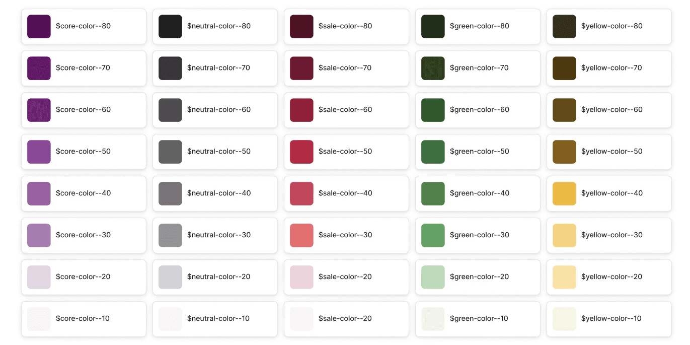
4Sight and PR use the Homebase Partner Home theme, while FH uses a different system, creating inconsistencies. Standardizing on the Homebase theme would ensure a cleaner, more consistent UI.

Color/Theme Findings
Typography Findings
Icons Findings
Color/Theme Findings
4Sight and PR use the Homebase Partner Home theme, while FH uses a different system, creating inconsistencies. Standardizing on the Homebase theme would ensure a cleaner, more consistent UI.
Color/Theme Findings
Typography Findings
Icons Findings
Color/Theme Findings
4Sight and PR use the Homebase Partner Home theme, while FH uses a different system, creating inconsistencies. Standardizing on the Homebase theme would ensure a cleaner, more consistent UI.

Sidebar: Reference for Component Creation
Sidebar: Reference for Component Creation
Sidebar: Reference for Component Creation
Sidebar Functionality
Sidebar Functionality
Variants enable easy customization, while smart components improve consistency and reduce development time.
Variants enable easy customization, while smart components improve consistency and reduce development time.
Variants
Variants
Provided a variant view to showcase component variations, helping designers understand options and adaptability.
Provided a variant view to showcase component variations, helping designers understand options and adaptability.

My impact and the next step of this project
My impact and the next step of this project
My impact and the next step of this project
My Impact
My Impact
Conducted design system audits across web platforms to understand the current state, then established a component timeline and designed the sidebar as a reference to guide future development.
Conducted design system audits across web platforms to understand the current state, then established a component timeline and designed the sidebar as a reference to guide future development.
Next Step
Next Step
Team will present to stakeholders to gain alignment and support, while continuing to collaborate with design teams to identify gaps and unify internal UI libraries. Despite challenges, we remain committed to driving this initiative forward.
Team will present to stakeholders to gain alignment and support, while continuing to collaborate with design teams to identify gaps and unify internal UI libraries. Despite challenges, we remain committed to driving this initiative forward.